Studio: The Plotting Panel
The Plotting panel can display multiple plots showing simulation data of specific components. The graphs can be configured and data can be exported in the form of a CSV file. Each plot can display multiple data points from different components and will automatically configure the colours such that each unique source is visible.
Adding Plots
The Plotting panel can be found, by default, next to the Inventory panel. If necessary, it can be added to other locations by clicking on the plus icon on any of the widget toolbars.
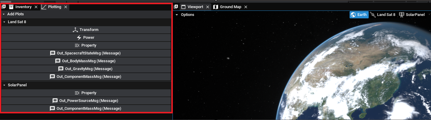
By default, there will be several plots available for the spacecraft selected and the component selected. For the spacecraft, there will be some default options including:
- The transform plots, such as position, geodetic location and attitude
- The power plots, which will appear if the spacecraft contains solar panels or batteries
- The data plots, which will appear if the spacecraft contains transmitters or data storage units
- The property plots, which enable the user to select a specific spacecraft property
- The message plots, indicated by the message icon, enable the user to select a property on the particular output messages from the spacecraft.
Additionally, for the selected component, plot information can be added for each property. There is a property option for selected a specific property and then also any output messages on the component will be shown as well. As an example, clicking on the Power plot for the ‘Landsat 8’ spacecraft will result in the following:
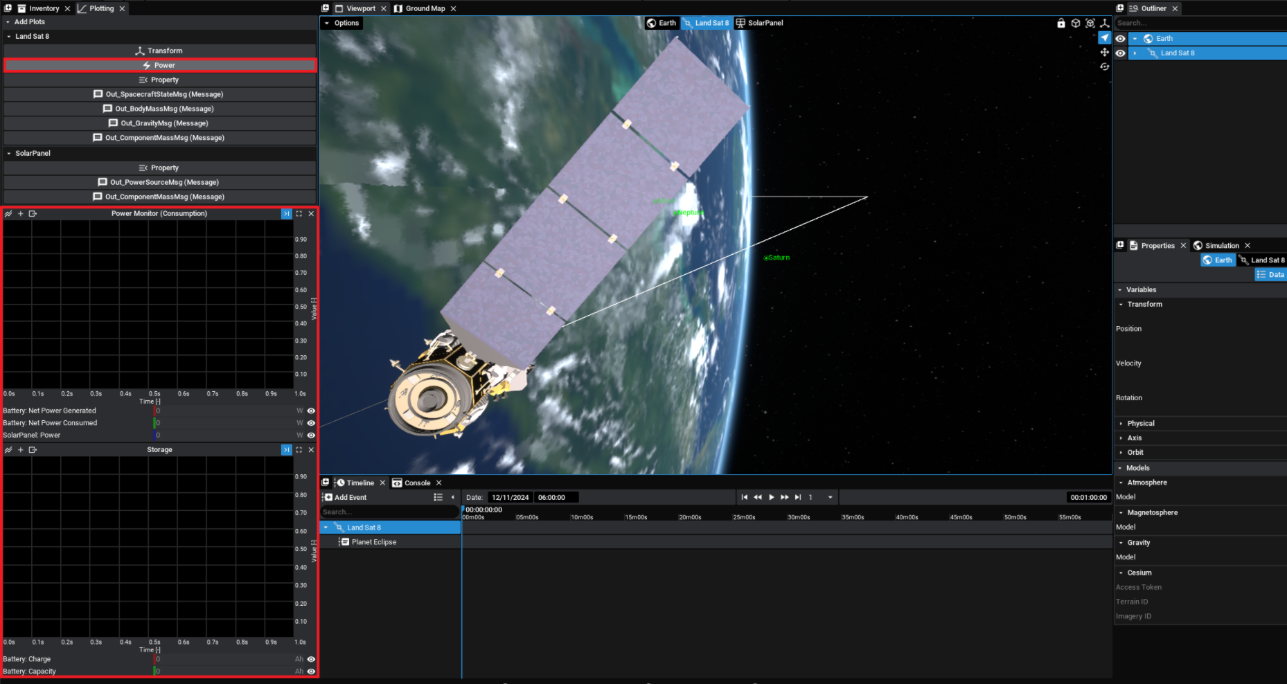
Once the simulation starts running, the data from the component will be added to the graph. If the data is in the form of a vector, such as Attitude, then all three parts of the vector will be displayed on the graph. When the simulation is running, the graph will be rescaled to fit all data points that are available on the graph.
Switching Types
Currently, both line and bar charts are available to be graphed. A line chart will show the data changing over the time of the simulation. A bar chart will show the current data at the current simulation time relative to the other properties being plotted. It is recommended that bar charts are only used for data with the same units. To switch the graph between the types, click on the plot type button (the first button) on the left side of the plot.
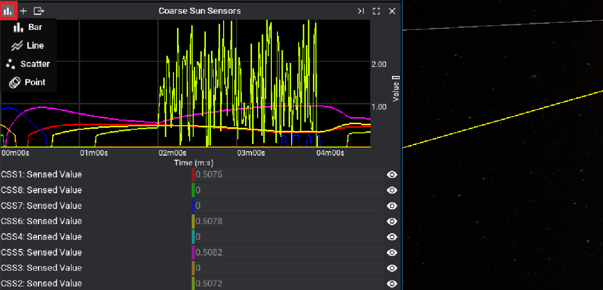
Note
Right-clicking on the button will display all plot types available. The Scatter and Point plots are useful for certain plots but may not be useful for typical time-series data.
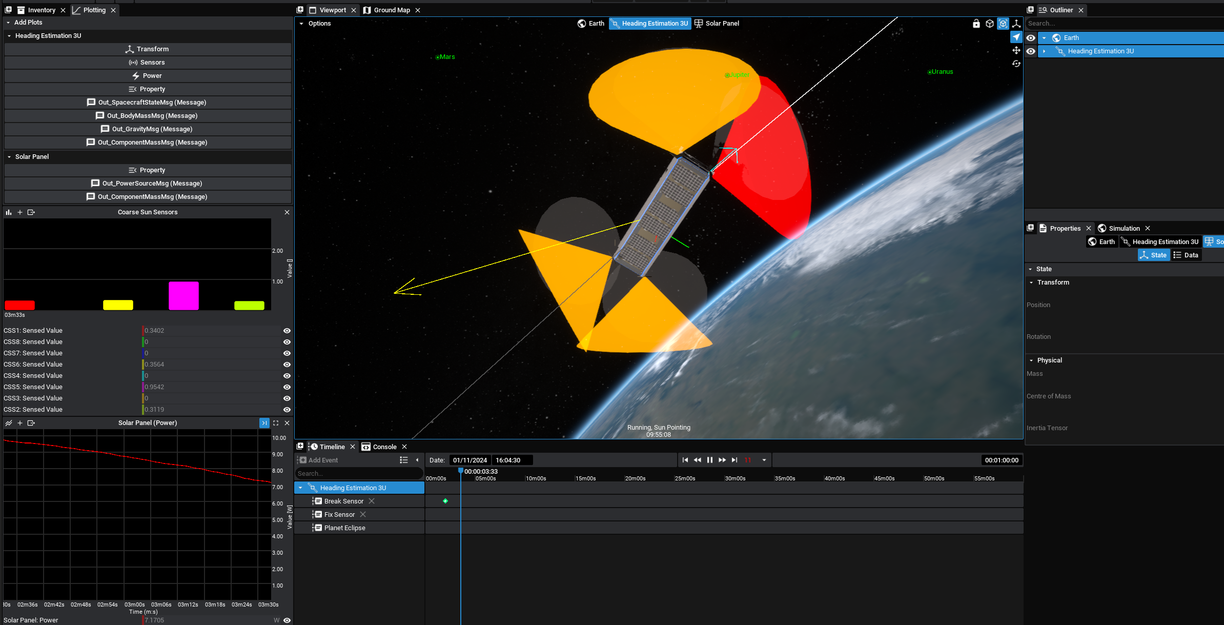
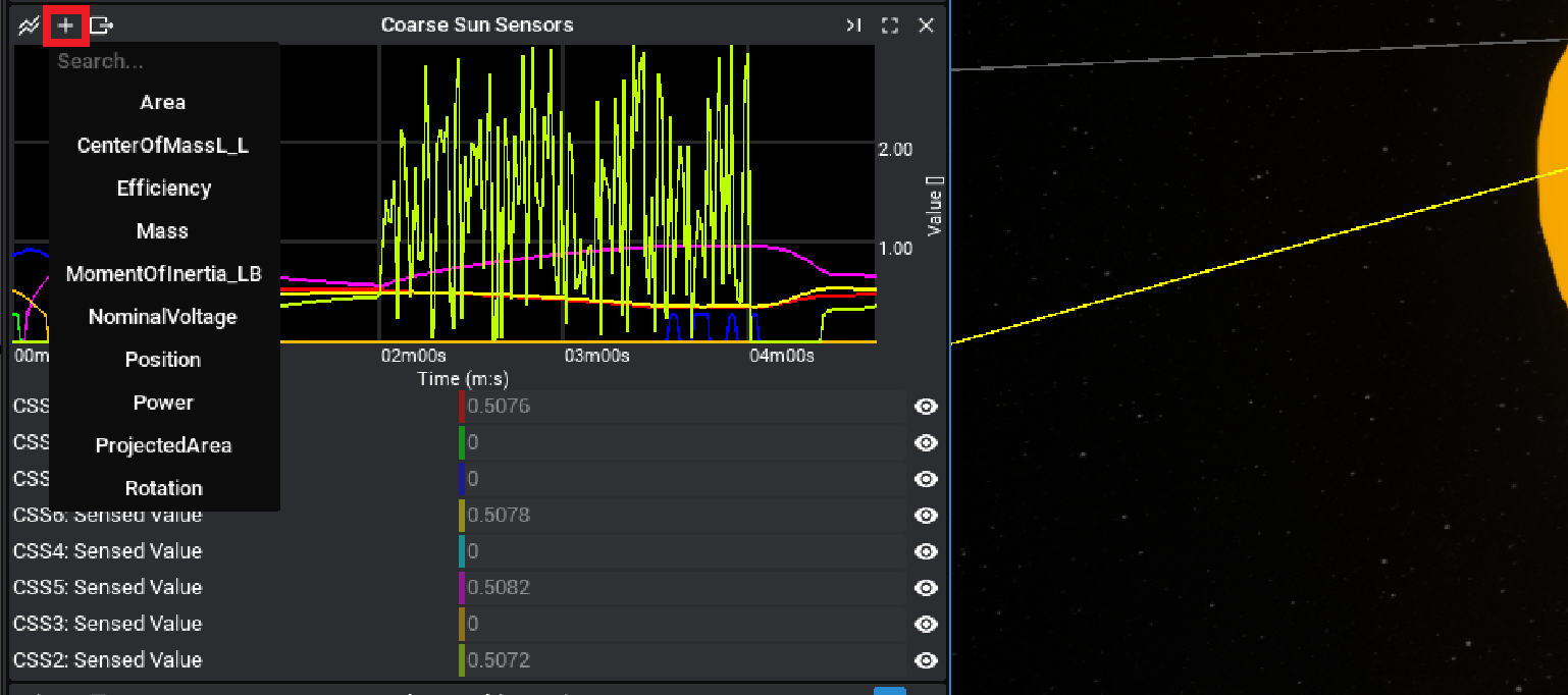
Adding Properties
The second button on each plot looks like an add symbol with the plus icon. Based on the currently selected component in the outliner, another property can be added to the plot on the same graph.
Note
The properties available are any saved numeric or vector data available on the component selected.
Exporting Data
Once an appropriate sample of data has been collected on the graph, the data can be exported as a CSV file. This can be done by clicking on the export icon above the graph. By default, the location will be in the Downloads directory of the project. The name of the file will also be the name of the graph (if it exists) or the main data point used, but this can also be changed in the file menu.
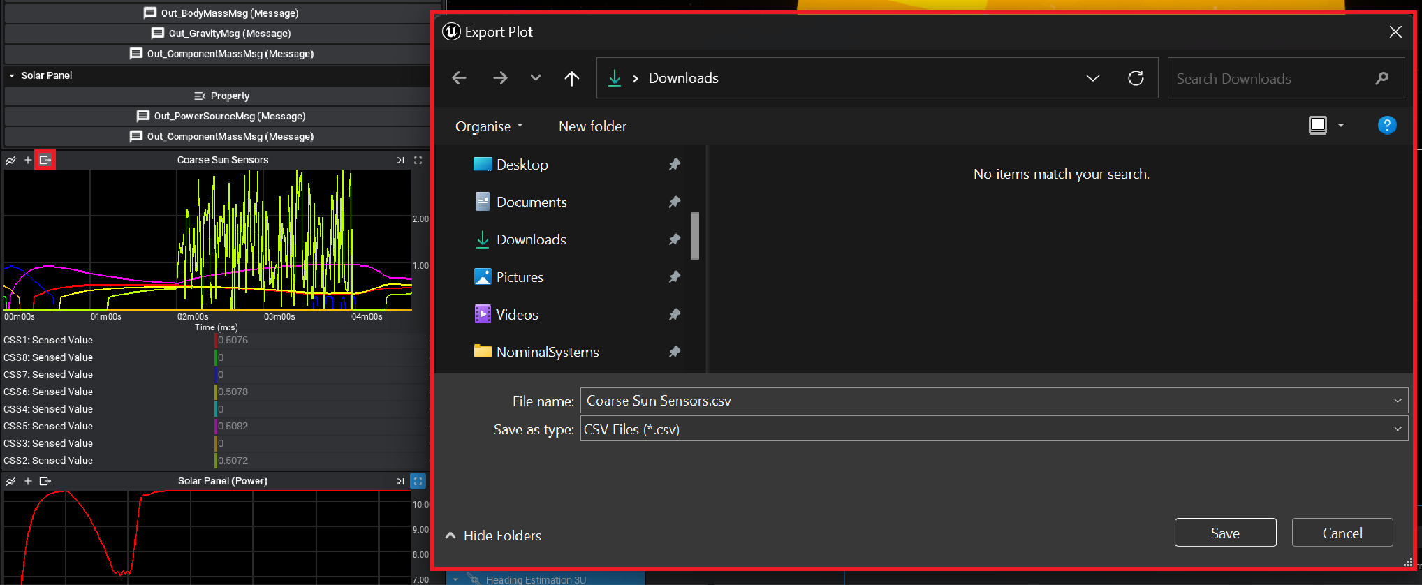
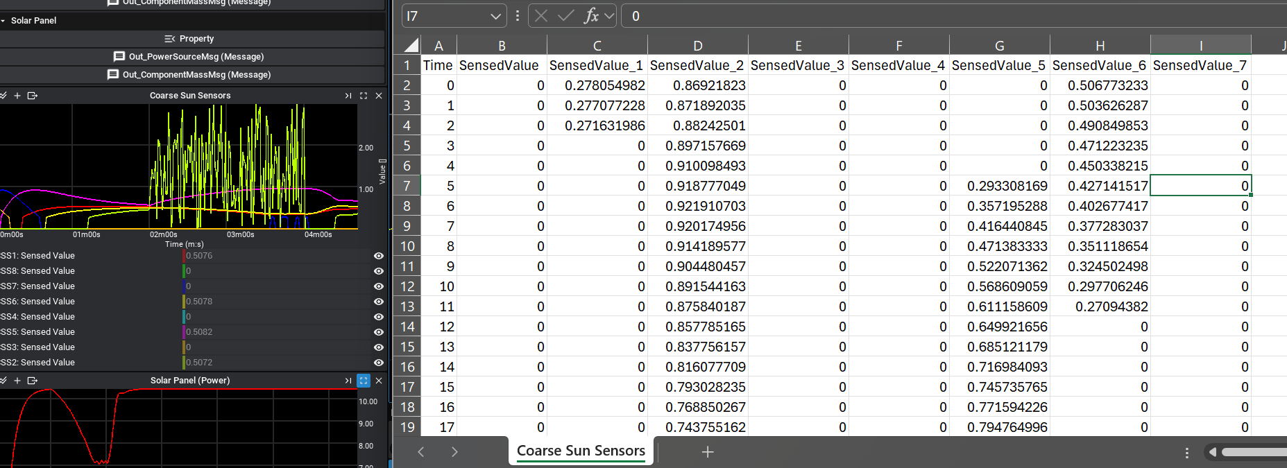
The file will be exported as a plot of time against data, regardless of which plot type was selected. Each of the properties will have its column and be associated with a specific time since the beginning of the simulation, in simulation seconds.
Note
By default, the graphs register new data every second. This can be configured in the Nominal Studio settings by adjusting the database to save time. It is not recommended to reduce this number to too small as it will cause the application to slow down due to the increasing number of save operations.
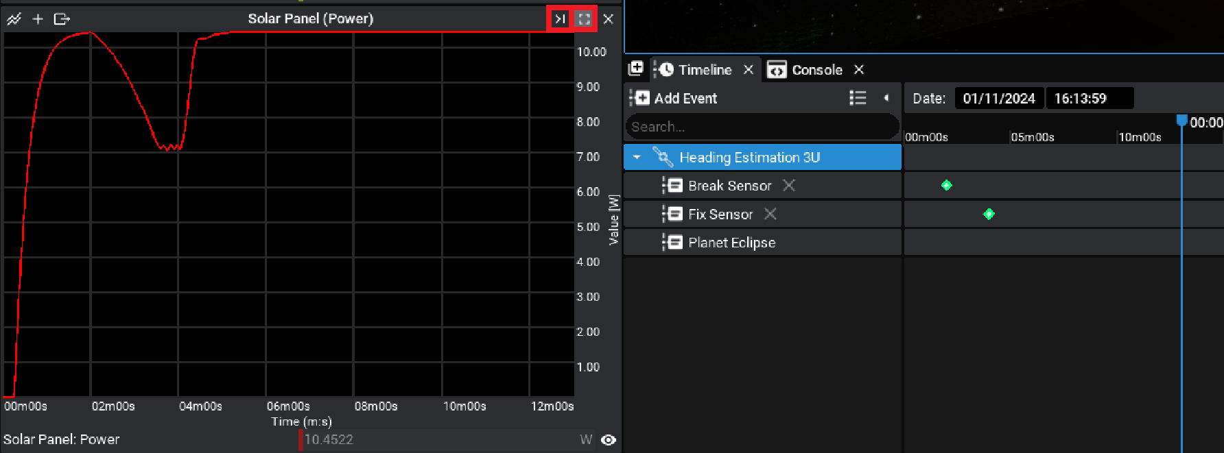
Plot Controls
By default, the plot will display the data from the last 60 seconds of simulation time (if the time has exceeded 60 seconds). However, switching between different plot views is available. By pressing on the full-view icon and the snap-to-time icons, the views can change. Clicking on full-view will switch to a plot showing the all-time data since the beginning of the simulation time. Clicking on the snap-to-time icon will change back to following the current time of the simulation.
To change the X-axis range visible on the plot, hold down the Control key and scroll using the mouse wheel. This will change how wide the plot is in simulation seconds.
Note
Regardless of the view of data shown in the plot, the export button will still output the entire history of data to a CSV file, provided it was recorded.