Studio: The Data Panel
Description
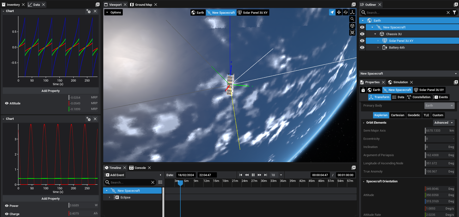
The Data panel can display multiple graphs showing simulation data of specific components. The graphs can be configured and data can be exported in the form of a CSV file. Each graph can display multiple data points from different components and will automatically configure the colours such that each unique source is visible. This guide will demonstrate how to access the Data panel and use the graphs.
Adding a Graph
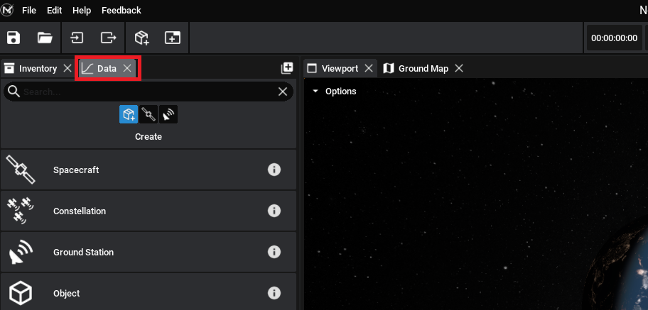
The Data panel can be found, by default, next to the Inventory panel. If necessary, it can be added to other locations by clicking on the plus icon on any of the widget toolbars.
To add a new graph to the panel, click on the Create Plot button. This will add in an empty line plot, with no data points. Clicking Add Property will register a particular property from a component that is currently selected. Select a component on the spacecraft (or any entity) and a drop-down list of all available data that can be plotted will be shown. As an example, selecting a basic spacecraft will display the following properties.
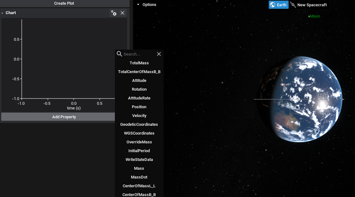
Note
If no data exists on the component or entity, or no object is selected, there will be no available properties to choose from.
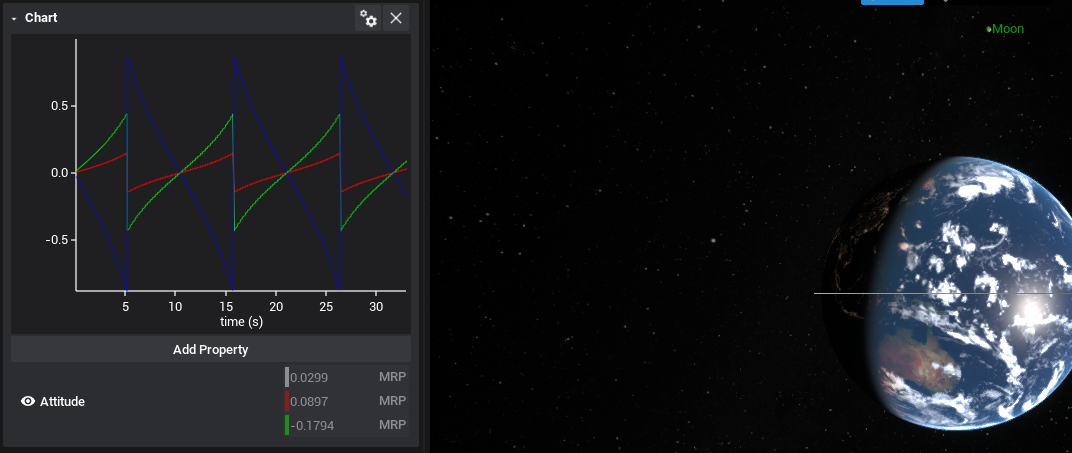
Once the simulation starts running, the data from the component will be added to the graph. If the data is in the form of a vector, such as Attitude, then all three parts of the vector will be displayed on the graph. When the simulation is running, the graph will be rescaled to fit all data points that are available on the graph.
Switching Types
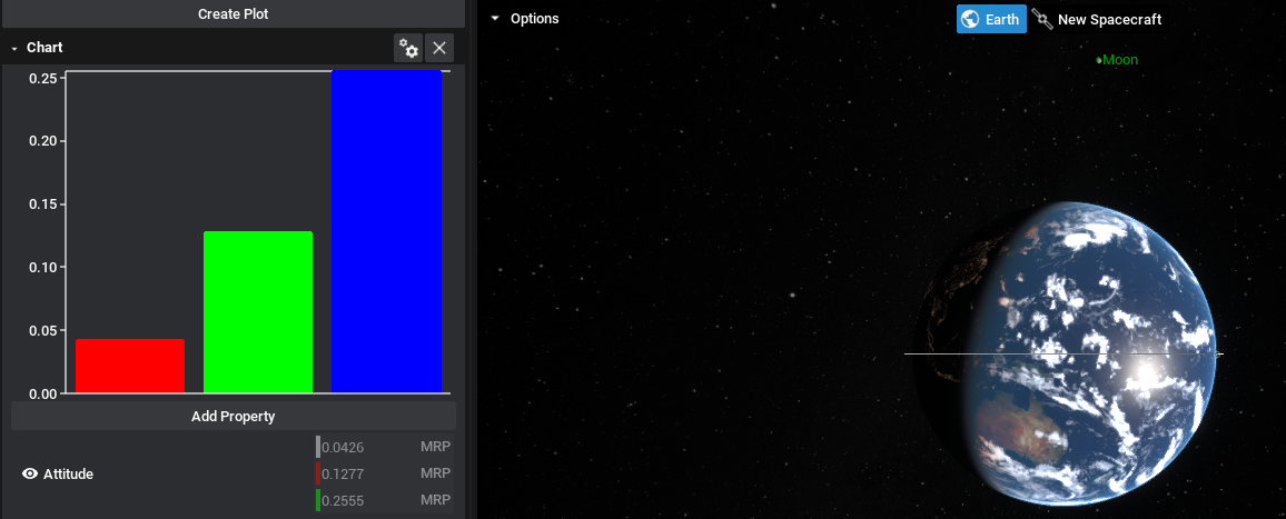
Currently, both line and bar charts are available to be graphed. A line chart will show the data changing over the time of the simulation. A bar chart will show the current data at the current simulation time relative to the other properties being plotted. It is recommended that bar charts are only used for data with the same units. To switch the graph between the types, click on the settings icon above the graph and switch the graph type.

Once switched, to generate new data, the simulation must be run or continued from the previous point. This will update the data and display the information on the widget.
Warning
If any data point on a bar graph becomes negative, it will not display the data on the same axis. This should be monitored when dealing with specific properties. Attitude, for example, will frequently alternate between negative and positive numbers on its component axis.
Exporting Data
Once an appropriate sample of data has been collected on the graph, the data can be exported as a CSV file. This can be done by clicking on the cog item above the graph and selecting Export. By default, the location will be in the Saved directory of the project. The name of the file will also be the name of the graph (if it exists) or the main data point used, but this can also be changed in the file menu.
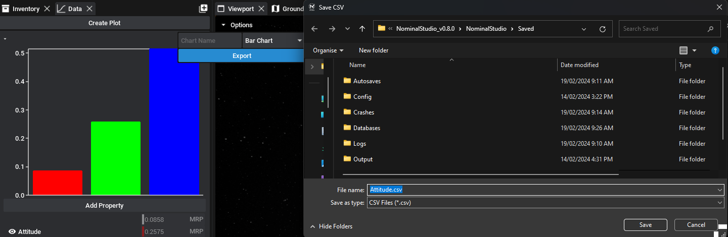
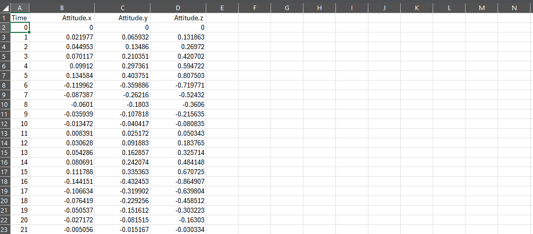
The file will be exported as a plot of time against data, regardless of which plot type was selected. Each of the properties will have its column and be associated with a specific time since the beginning of the simulation, in simulation seconds.
Note
By default, the graphs register new data every second. This can be configured in the Nominal Studio settings by adjusting the database to save time. It is not recommended to reduce this number to too small as it will cause the application to slow down due to the increasing number of save operations.
Multiple Graphs
The Data panel allows for multiple graphs to be added to the same panel. Each graph can have different amounts of data and parameters and can also register several unique properties from different components. As an example, a plot could contain both the power being produced by a solar panel and the charge of the battery that is connected.